Friday, 9 December 2011

1st draft of 2nd page.

This is my 1st draft of my second page, of the double page spread.


The text:

How did you get into music?
I have always like music, from a young age. I listened to it, and then my mum asked me if I wanted singing lessons, so I went and fell in love with singing. From then on singing became my passion.

What was the first CD that you ever brought?
I still remember it was S Club 7. How embarrassing! *Laughs* I always had a really bad taste in music and all my mates laughed at me for it. Know that I think back it was awful I just like the full cheese. Still to this day you give me a cheesy song and I will love it. How embarrassing!

Your new song is called 'For you Zoey', what is the meaning behind this?
Well before I made this, one of my good mates Zoey sadly passed away and I wanted to do it in remembrance of her. She was one of my closest friends, and jokingly she has always wanted me to write and sings a song about her, so I knew she would love this. I mainly did this for my friends and her family so we could remember her, i never knew it would be such a hit!

That's lovely, who did the backing track to the song?
That would be my amazing friend Jake. I've known him for years and he is amazing at music. I came to him with this idea and the lyrics in which I knew i wanted to use, and came up with some ideas for me. He is the one who played the drums, piano and guitar throughout the piece. We did it in his fantastic recording studio and we put it all together. I would like to thanks Jake so much, without him I wouldn't of been able to do this!

1st draft of 1st page.

This is my first draft of  my 1st page, of the double page spread. I am not to sure on it at the moment. Personally the more I look at it and edit it, I don't think it works. The aspect in which I don't feel works is the main image. I am going to ask my target audience, the people in my media class and my teacher to get feedback on it. The I will change it according the what they say.

1st draft of contents page.

This is the first draft for my contents page, to go in my music magazine.

1st draft of background for contents page.

I have created a background for the contents page, however I am going to have to change it, as I feel it wont work. The reason for this is because my house style colours are; turquoise, black and white, and this background contains all three, so I wouldn't be able to have the text in one of these three colours. Also it will be hard to find a colour, that will stand out against all three of these colours.
The background;

1st draft of front cover.

This is the first draft of the front cover for my music magazine.

Feedback from teacher and media students.

I had started to do my front cover when I asked for feedback on what she thought. This is the stage it is at.

The feedback which my teacher gave me was that she didn't like the font in red and she didn't like the title on the slant. The feedback in which the media students gave me was, that they don't like the title, written in that style. I am going to take all of these into consideration and modify to make it better.

My final Picture.

My final picture for my front cover is as follows.

Thursday, 8 December 2011

My third idea.

My third idea is to have a photo of a person. Luckily I have done one of these for my photography course as well.
Some of the images are as follow;


My second idea.

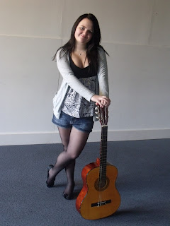
My second idea for my front cover, was to do either a person with a guitar or just the guitar, but from a different angle to normal.
I did a photo shoot with my friend Ellan and these are some of the photos in which came out of the shoot. I tried to go for the music look, so she is using my guitar in every photo.


I am not going to use these images as my front cover as I feel they give off the wrong message for my magazine.


My first idea.

My first idea, for the front cover was a picture of a hand holding a rose. I wanted to do it so the background was black and the rose would be a really vibrant red, (I would Photoshop the image to do this.) I couldn’t do this because it is the wrong time of year to have roses out, so I have a major problem in that aspect. I had some photos from the summer of roses, and this was going to be my next idea. The photos were:


With the bottom picture, I was going to make the background black and white, however I did this and it didn't look like a music magazine so I had to scrap that idea and come up with another one.

Flat Plans.

These are my flat plans for my magazine:


Front page:


Contents page:


First page of double page spread:


Second page of double page spread:

Possible Names.


I wanted the title of my magazines name to mean something. So i had the idea that I would use some music terminology, and make that the title. These are some of the possible titles;
  • Beat
  • Bass
  • Cymbals
  • Duet
  • Minim
  • Mute
  • Note
  • Part
  • Polka
  • Theme
  • Unison
  • Voice
  • Rock Chic

I like these because they are simple and straight to the point. At this moment I don't know which one sound most like a magazIne title, however one of these will be the title of my magazine.

My Target audience.

The target audience, I am going to try and aim at is ages 16 to 22 roughly. I based this on the findings from my questionnaire  and I hope to be able to create a magazine suitable for them. I am going to try and base it mainly on the rock genre, however I  will try to have a little bit of everything in there, so there is something for everyone.    

My findings fron the questionnaire.

I sent out ten questionnaires to people of the age group 10-30.  I have used a variety of males and females, because I want to find out if there are any similarities, in which I would work with for my project. These results will help me, when it comes to making decisions for my magazine.
My results –
Gender
Males asked – 5
Females asked – 5
Age groups
11 – 20 – 6
21 – 30 - 4
Genre of music -
Jazz - 5
Rock - 6
Classical - 6
Pop - 4
Indie – 3
Other - 0
What do you look for in a music magazine?
  • Relates to genre
  • Good bands
  • interviews
  • New and old bands
  • Music information
  • Artist information
  • Festivals
  • Freebies
  • Relates to all genres (a bit of everything)
What price would you pay?
£0 - £1 - 1
£1-01 - £1.50 - 4
£1.51 - £2 - 6
£2 + - 0

What do you look for in a front cover?
  • Pictures
  • Interesting headlines
  • Adverts
  • Bold Texts
  • Information
  • Not much text
  • Good photography
What would entice you into a music magazine?
  • Relates to personality
  • Colourful background
  • Freebies
  • Speaks to the reader
  • Looks professional

My questionnaire.

My questionnaire about magazines:

1) Gender: (please circle one)

Male Female

2) Age group: (please circle one)

0 - 10     11 - 20      21 - 30      31 - 40      41 - 50      50 +

3) What genre of music do you enjoy? (please circle where applicable.)

Rock Pop Indie Classical Jazz Other


If other please state: _________________________________________________________

4) What do you look for in a music magazine?

____________________________________________________________________

5) What price would you pay for a music magazine? (please circle one)

£0 - £1 £1.01 - £1.50 £1.51 - £2 £2.01 - £2.50 £2.51 +

6) What do you look for in a front cover of a music magazine?


_____________________________________________________________________

7) What would entice you to a magazines front cover, more than anther one?


_____________________________________________________________________

About Q Magazine.

Q magazine is distributed in 3 different countries: UK, USA and Australia. The publisher is Bauer Media Group. It is a monthly magazine, which is of the genre music. More specifically the Rock, Indie and Alternate genre.
Q magazine is aimed at the age group of, around 18 – 25. The stereotype of the people who read this magazine is, festival goers and people who enjoy listening to music, most of the time.   In my opinion it is aimed at students. This is because of the price is quite cheap, for what you are getting and also the content in the magazine I feel is aimed at students, because of the language and content used.

Tuesday, 6 December 2011

About Kerrang.

The publisher of Kerrang magazine is Bauer Media Group. The genre of the music which this magazine fits into Rock, stereotypically “Emo”, “Goths”. The age group which I feel the magazine is aimed at is 18 – 25. This is the student age, and I feel it is aimed for them. I think this because the content in the magazine, the price in which it cost, is quite cheap for what you are getting.

Similar products - About NME.

NME was launched in 1952, produced weekly. The genre for NME magazine is music. More specifically the Rock and alternative genre of music. The publisher of the magazine is IPC Media. The audience which I feel the magazine is trying to target is, music lovers, festival goers, around the age of 18 – 25. This is the student age category. You could tell from the magazine that was a student magazine by the content, images and the type of things given away.

Deconstuction of pop stars magazine.

The masthead is the bold yellow bubble. It stands out above the rest of the front cover. This magazine has an unusual masthead because normally it runs across the top of the magazine, but the editors have placed it in the top left corner, which means it’s not as big as the other competing competitors. However on this magazine I feel that it works. This is because it is a bright colour on another bright colour, which clashes, so makes the "bubble" stand out even more, catches the reader’s eye and draws them to the magazine. I like how there is a star underneath the title "pop stars" and how the text is as if, it is going around the bubble.

The main puff is the bubble writing which says "crush diary." This is in bright yellow because it stands out against the background.

There isn't just one central image. There are many images which make up the front cover. There is one image which is main over the rest of them, which is of the guy who looks are 15, in the blue top. This is completely different to most magazines because normally there is just the one main image which takes up the whole of the front cover, not many different ones.

This magazine doesn't have a plug or a cover line, which is very unusual when it comes to a magazine because these are two of the main components which make a magazine sell. It gives an incite into what is on the inside of the magazine. I say this however; the whole front cover is plugs, because it shows what the content of the magazine is. Normally, this is just in a line, either at the top or the bottom of the magazine, not all over the front cover because it makes it look very cramped, which on this magazine I feel that is the case.

In the sweet spot, there one of the stories which, are in the magazine. Although on this magazine, the sweet spot isn't really a spot, it just emerges into the rest of the front cover there isn't anything different bout that area.

I feel that this front cover is very cramped and busy. I don't like it. However the audience it is trying to target i feel is girls aged 5-8. This is done by using the colours pink and yellow, very feminine colours. It has pictures of boys all over the front, which is aimed at girls.

Deconstruction of NME front cover.

The mast head is short and simple. It is in red, because it is bright and bold. I believe they have used a white outline, because it makes the red stand out even more. It is placed at the top, because it mean, when the magazines are in the shelving, people can still see it and recognise it, because that is the part that the audience see and recognise.

The puff is the red and white centred bit. The reason why NME have used the colours red and white because the title is in red and white, so it links in to the mast head. The puff is in bold and different colours because it makes it stand out more, and it also catches the audience’s eye. It is the first thing that you look at.

The central image is of the main singer of the band. This is because it relates to the main article of the magazine. The image is very plain, with a black background with a white light at the back. This has been done because it makes it look they are in concert, and it makes him stand out more with a plain background, you eye is focused on him and only him.

The plug is at the top of the magazine, onto of the mast head. This is to do with one of the main items in the magazine. This is done because, when the magazine is in the shelving the readers can see it, and read it. They can decide if the like the band/ what the item is about and if they do then they would pick it up and read more. These are bold, and in yellow/ gold, with a black background, because this makes it stand out and makes it catch the audience’s attention.

In the sweet spot, there is two items, which are included in the magazine. They have used the colours yellow / gold, because it related to the plug, by using the same colours. It stands out because it is on a black background and it is bold. They have used white underneath it, because the white stands out on the black background. This is unusual because normally, they use pictures in these areas, because it catches the audience’s eye more; however I feel this works for this magazine because it gives more information across about the magazine and what’s inside it.

The cover line is on the bottom. They have done it in an usual style because, normally it goes straight across the bottom, whereas on this magazine, they have done it so it goes across half of the bottom, and done it double the thickness. They have used a red background because it stands out with the black background, and used black for the world "plus" because red and black go together and works, while standing out, and they have used white for the contents of it, because it stands out on the red background, and draws your eye towards it. They have used black in between the white, because it makes the white stand out even more and connects to the black of the word plus.

Deconstruction of similar products.

The central image is covering the mast head; this is because the magazine is well known, around its audience. They recognise it so much that it doesn’t need to be the whole mast head showing. This also shows the magazine has power over other products of similar type, because they are making a statement that the mast head isn’t the main aspect of the product. The central image is a bold image, which stands out about all the other aspects on the front cover.
There are 3 images in the sweet spot (the bottom left hand side) which are advertising; that within this magazine you get 3 free special posters – just for the readers. This is done to draw the audience in, making them want to buy the magazine, also it makes it stand out and be individual, from other magazines and seem different so it would entice them into this one more, and make them want to pick this product up over others.
Underneath the sweet spot, is a puff. This is the word “plus”. This is big and bold; it stands out above everything else on the front cover of the magazine. This catches the reader’s eye and then they would carry on and read the cover line, which runs next to it.
The cover line runs along the bottom of this magazine. This is because; you eye is drawn there after looking at the sweet spot. Also with the plus being big and bold, this draws your eye to it and then you immediately read along, to find what is in the magazine. This is a selling point for the magazine because people find out what they can read about inside, and if they like the items, such as the bands then they will be more enthused to buy the magazine and be more wanting to spent their money on it.
The plug is on the top of the magazine. This is placed here because; it is one place that people can see even when the magazine is in the shelving. This would draw the attention of the on-looker to this magazine because they would see the masthead, and recognise that it is a Kerrang magazine, and then read the plug (which would tend to be the best article), and if they liked it, then they would be more attracted to buy it. This does sort of the same job as the puff; however the puff goes into more detail about the articles inside.
This magazine doesn’t use any direct mode of address. This is odd for a magazine because normally this lures the audience into the magazine, because they feel that the front cover is talking to them personally, they feel included and part of it.